Plugin Introduction
Video plugins refer to elements such as images, videos, text, audio, stickers, filters, effects, subtitles, etc. Additionally, we can customize plugins to meet various complex business requirements.
For example, a chart plugin can insert charts into videos, and a QR code plugin can insert QR codes into videos. Plugins are drawn based on canvas, so any canvas element can be made into a plugin and added to videos.
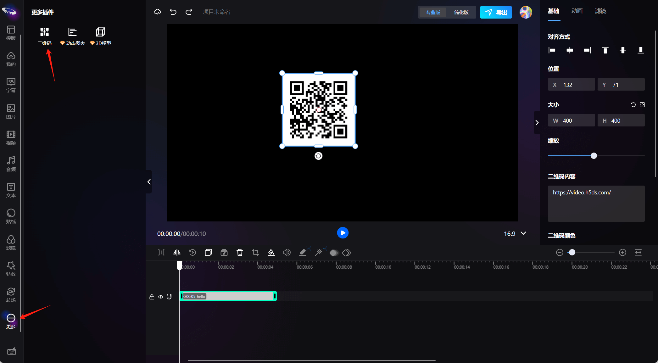
The plugin entrance is in the more menu, and you can click the plugin to add it to the canvas.
Plugin Usage
Plugin development currently uses React components, so you can see that both the preview area component and editor area component of the plugin are React.FC types. The ElementData data class is a class that inherits from BaseElement.
import { VideoCoreSDK } from "@h5/videoCoreSDK";

// Plugin parameter description, assuming the QR code plugin is qrcodePlugin
interface PluginParams {
  type: string; // Element type, also the unique identifier, such as: image, video, audio, effect...
  name: string; // Element name, such as: Image, Video, Audio...
  version: string; // Version number
  ElementData: new (n: any) => BaseElement; // Create element data class
  Element: React.FC; // Preview area component
  Options?: React.FC; // Editor area component corresponding to the editor
}

const qrcodePlugin: PluginParams = {
    type: 'qrcode',
    name: 'QR Code',
    version: '1.0.0',
    Element: ...,
    ElementData: ...,
    Options: ...,
}

// Create rendering core instance
const vc = new VideoCoreSDK({
  data: MovieData, // Required, project data
  env: "preview", // Required, rendering mode: editor (editing mode, can drag and edit); preview (preview mode, only preview, smaller memory consumption)
  registerId: "", // Required, registration ID, bound with domain name
  workerPath: "assets", // Optional, reference directory for decode.worker.js, default is assets
  scale: 1, // Optional, canvas scaling ratio, default is 1
  currentTime: 0, // Optional, default start time is 0
  plugins: [qrcodePlugin], // Optional, extended plugins PluginParams[]
});

// Initialize core
const core = await vc.init();

/**
 * Assuming the project data is movieData, build plugin data -> add data -> update view
 */
// 1. Build QR code plugin element data
const elementData = new qrcodePluginConfig.ElementData({
  text: "https://video.h5ds.com",
  colorDark: '#ffffff', // Background color
  colorLight: '#000000', // Color of block area
  correctLevel: "H",
  size: 200,
});

// Center position
elementData.style.x = movieData.width/2;
elementData.style.y = movieData.height/2;

// 2. Add plugin element to data
movieData.elements.push(elementData);

// 3. Update view
core.update();
Plugin Development
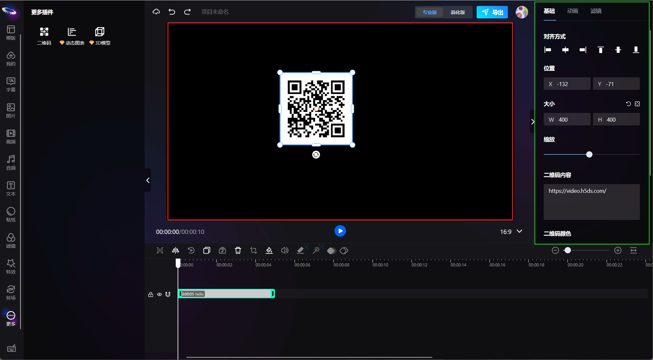
Before developing plugins, you need to understand some concepts: preview area and editor area; the red area in the figure below is the preview area, and the green area is the editor area
Additionally, we need to master Canvas, React, and Typescript, as our plugins are mainly developed based on React hooks.
For video plugins, the modules we need to develop include:
Preview area component (canvas display area, mainly developed based on Canvas, with built-in pixijs framework, can directly use pixijs for development) - React component
Element data class (inherits BaseElement, mainly used to build project data) - class
Editor area component (component for element parameter setting area, on the upper right side of the interface, mainly used to modify element data and then update the view) - React component, meeting the above technical requirements, let's develop a simple plugin!
Plugin Tool Library
We have built-in some commonly used components and tool libraries for plugins, which can be found in @sdk/videoEditorSDK.react.es.min.js. This package exposes two variables externally, options and plugin. The specific usage instructions are as follows:
import { plugin, options } from "@sdk/videoEditorSDK.react.es.min.js";

// Preview area components
const {
  useSyncPixiElement, // Bind data with pixi elements, syncPixiStyle is a method to synchronize element data and Pixi element styles, syncPixiStyle({ ...element.style }, pixiElem);
  Animate, // Animation module
  ControlElment, // Controller module
  useElementFilter, // use for element filters
  useMask, // use for element masks
  utils, // Non-business plugins
  helper, // Business plugins
} = plugin;

// Editor area components
const {
  Background, // Background settings
  FontScale, // Text scaling settings
  Lottie, // Lottie parameter settings
  BlendMode, // Blend mode settings
  Align, // Text alignment settings
  GroupAlign, // Group alignment settings
  Opacity, // Opacity settings
  TextContent, // Text content settings
  TextStyle, // Text style settings
  Animation, // Element animation settings
  Audio, // Audio related settings
  Filter, // Filter settings
  Position, // Position information settings
  Rotation, // Rotation angle settings
  Size, // Size settings
  Speed, // Speed settings
  Transition, // Transition parameter settings
  Item, // Layout module
  Mask, // Mask settings
  Colour, // Color settings
  Strength, // Strength settings
  GreenScreen, // Green screen settings
  TemplateMode, // Template parameter settings
} = options;